How We Simplified Time-Tracking with Slack, BigQuery, and a Power BI Dashboard
September 29, 2017
Here at Thinking Machines, we’re often juggling anywhere between 10 and 20 projects at a time. As our team has grown, it’s become more difficult to keep track of what everyone is doing.
We believe that a data science company ought to be data-driven. Since we spend so much time building dashboards for clients, we wanted to do the same for ourselves! A great way to understand your customers and get better at what you do is to “eat your own dogfood.”
Over the last few weeks, we developed a system to easily turn our data detritus into a live dashboard. The goal was to make sure that everyone in our organization could see in real time how each person is using their time and on what projects.
Data Ingestion from Slack
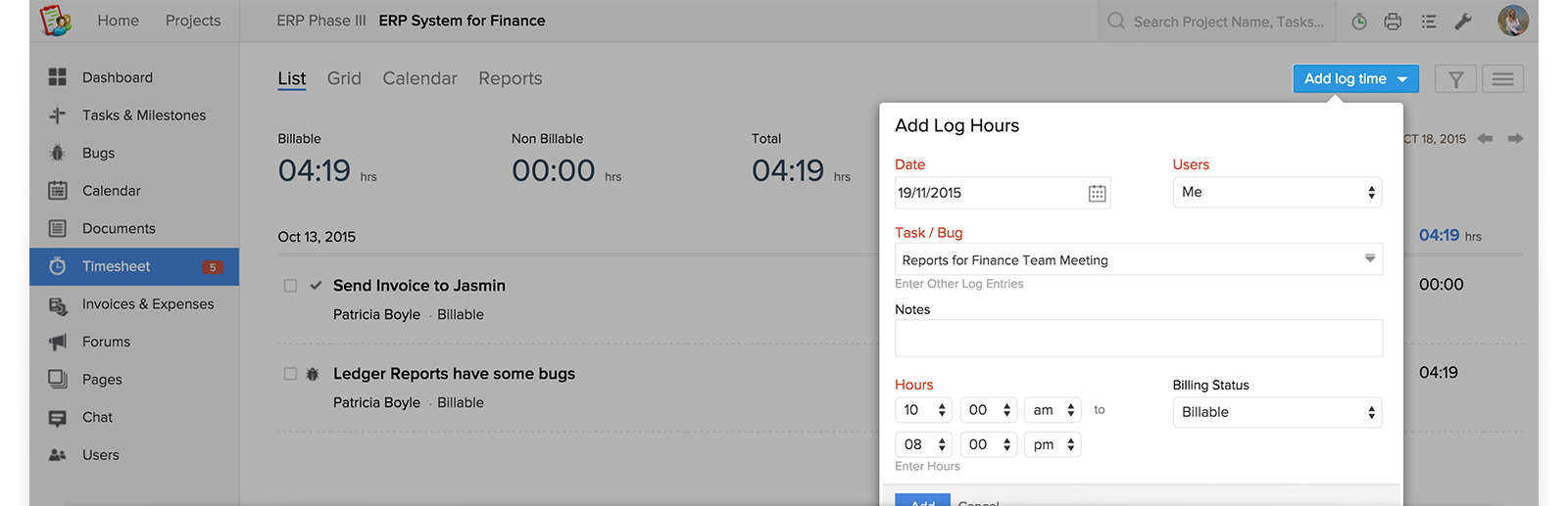
The first step in building a dashboard is, of course, to start collecting data. So where would we get data about our team’s working hours? We first tried recording our man hours using Zoho, a project management tool. When you create a task in Zoho and assign it to someone, you can indicate the number of hours that you expect that task to take. And when you complete a task, you can also log the exact number of hours that it took to finish the task:
We gave it a few months to see if we liked using Zoho, but adoption among our team was low. The problem? Tediousness. Micromanaging is not the way we do things at Thinking Machines. Our project managers usually give their teams general objectives and deadlines, but it’s up to each individual to define their methods of attack and task breakdowns. Also, our team hates filling out forms (who doesn’t?!).
So after several months of trying and failing to use Zoho consistently, we tried using another tool to get the job done: Slack. Like many tech companies, our team LOVES using Slack. The tool is just so fun and intuitive, you hardly have to convince anyone on our team to use it: we just do. Since our company began two years ago, we’ve gotten into the habit of posting to Slack a list of what we accomplish each day. All these go to our #dailycheckin channel.
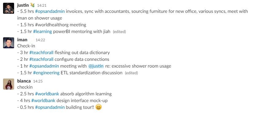
To start tracking our hours, we tweaked this habit in a small way: for each item we listed, we started attaching: 1) the number of hours we spent on it, and 2) a hashtag representing the project to which that task is related. This is how our daily check-ins looked with these tweaks:
At first, only a few people on the team started writing their daily check-ins this way. After about two weeks of manually recording the results in a spreadsheet, we generated a simple pie chart showing the number of hours these early adopters spent on different projects, which we demo'd to great acclaim during a team meeting. Fully bought in at this point, everyone on our team started writing their check-ins the new way.
There are a number of important lessons here for any organization interested in becoming more data driven:
- Becoming data-driven is as much about people as it is about technology. Any organization that wants to use data to make smarter decisions will often need to rethink its workflows for collecting and sharing information.
- Go for quick wins. Implementing change is hard. But people are often more willing to change habits or adopt new ones if they see the concrete benefits. Rather than rolling out process changes to your entire organization at once, start with a few early adopters who are easy to convince and willing to experiment. Win buy-in from the rest of the organization by demonstrating how even small scale data collection can yield useful insights.
- Use tools that people already love. Sure, Slack isn’t the most obvious data collection tool. It does take us more effort to transform our Slack messages into a tabular format that can be analyzed and visualized. But all these issues were easier to address than convincing our team to fill up forms every day. In the end, the best tool is one that your people will actually use.
Data Warehousing on BigQuery
After a few weeks of this, we already had a good amount of time tracking data on Slack. The next problem: How do we get the data into a database that we could query online? Luckily, the Slack Events API makes it possible to build a program that can receive real-time data from a Slack team account. When saved to a database, each Slack message looks like this:
{
    "type": "message",
    "channel": "C2147483705",
    "user": "U2147483697",
    "text": "Hello world",
    "ts": "1355517523.000005"
}
You’ve got here the type of event (message), the unique ID of the channel to which the message was posted, the unique ID of the user who posted the event, the message text, and the unique timestamp.
Traditionally, setting up your own database means setting up servers, but there are a lot of free/affordable services that you can use. In this case, we started with Google Firebase, a fully managed mobile and web development platform that’s great for prototyping. Our Slack-to-Firebase pipeline took under 24 hours to set up.
While data loading on Firebase was easy, querying features in Firebase are quite limited. You can only filter through keys or a single field and it's done awkwardly by ordering and splicing with range. So we moved our Slack data to Google BigQuery, another one of Google Cloud Platform’s fully-managed database services. Now, every Slack event that hits our Firebase function also gets stored to BigQuery. If we were to do this project again, we’d probably build it using Google Cloud Functions directly, but the set-up works for now.
The best thing about this system so far? It’s dirt cheap! Firebase allows for up to 1GB of free database storage, while Google BigQuery allows for up to 10GB worth of storage and 1TB worth of queries. If you’re running a small team like ours, this is more than enough capacity, and easy to scale up when needed. This brings us to Lesson 4 of this dogfooding experiment:
Don’t build everything from scratch. Fully-managed tools like Firebase and Google BigQuery will work great for 95% of use cases.
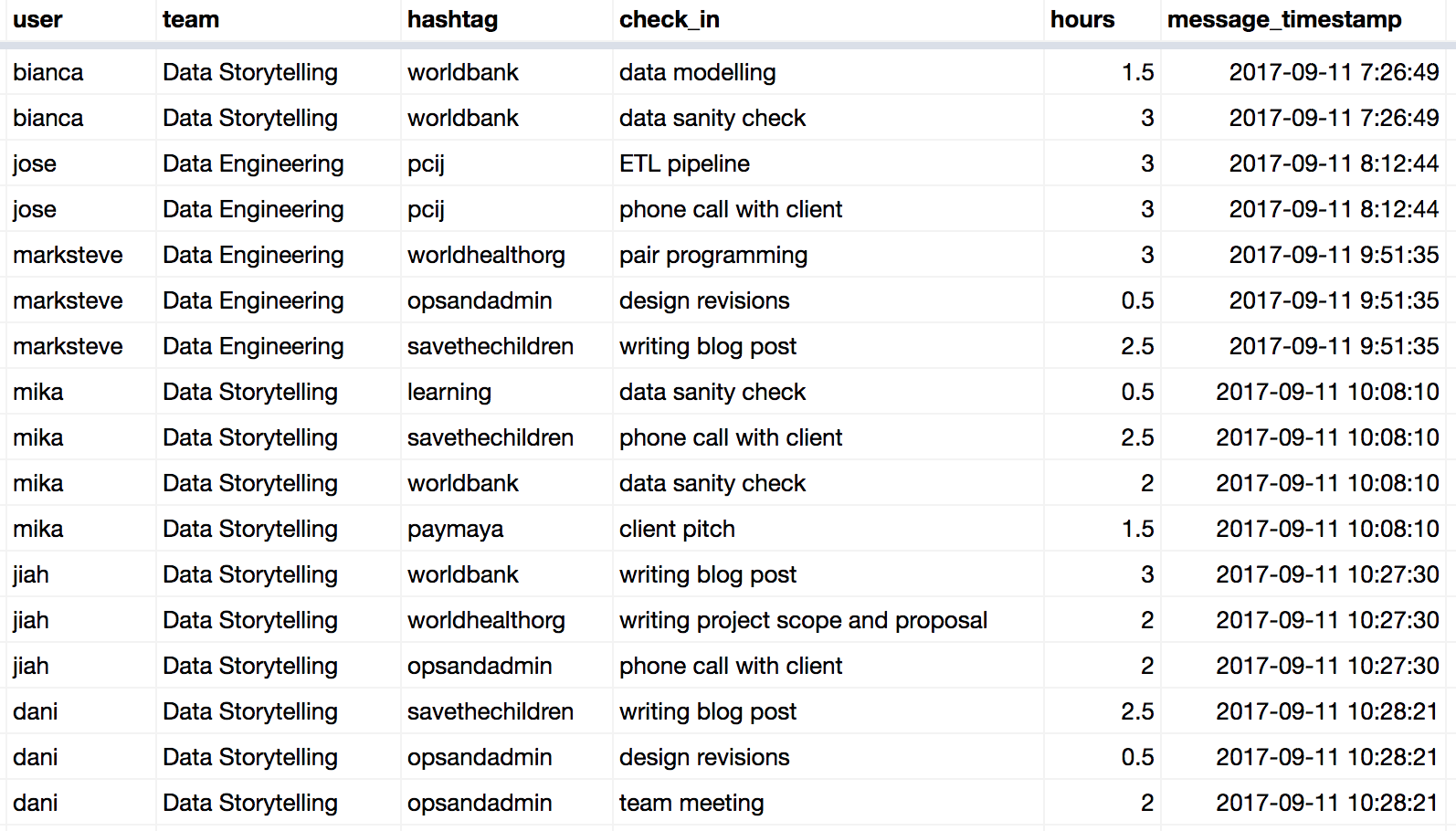
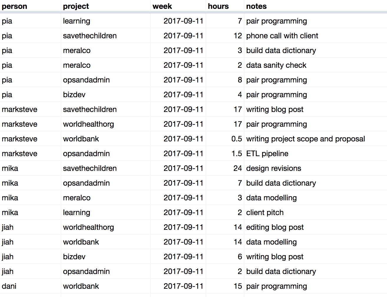
At this point, we now had a database of our Slack messages in Google BigQuery. Using some regular expressions and SQL queries, we took our raw dump of Slack messages and broke each message down into more granular time logs, each associated with a team member, a project, a timestamp, and a duration. Luckily, everybody on our team uses consistent formatting when posting their check-ins, so this made it easy to automate transforming the data. The resulting table looked like this:
So we had the data! Now for the fun part: turning the data into a visualization that could quickly show us what people are spending their time on.
Dashboard building with PowerBI
There are a number of data visualization tools that organizations can use to build dashboards. Tableau is still one of the most popular and fully-featured data visualization tools, but quite expensive unless you’re willing to make your data publicly available – a deal breaker for us. So for this project, we used two more basic but more affordable data visualization tools: Google Data Studio and Microsoft Power BI. Google Data Studio is free and web-based, but because it’s still in beta, has very limited features. Microsoft Power BI’s Desktop application can be downloaded for free, but you’ll need to pay around $10/month/user to share and collaborate on dashboards via Power BI Online. If you’re experimenting with making dashboards for the first time, both tools are excellent, low-cost starting points.
We tried Google Data Studio first, since it integrates easily with Google BigQuery. The first visualization we produced was a simple bar chart showing the number of hours spent per project. This view allows for filtering by time frame or team.
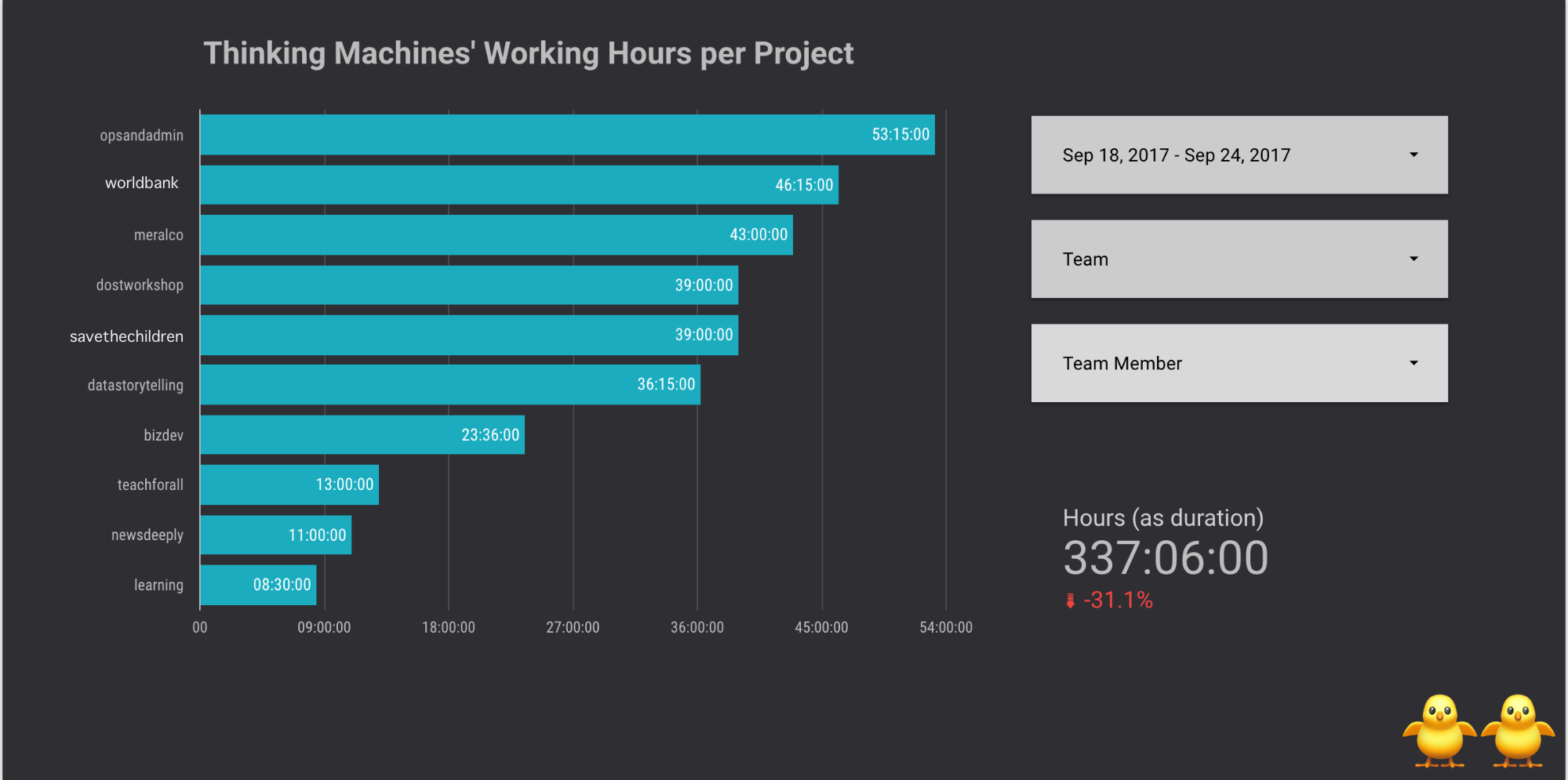
When building dashboards, it’s often difficult to know where to begin. Our advice: start with the simplest, most obvious views and see what questions these elicit! In our case, we wondered how our actual hours matched with planned hours. Which projects took more time than planned, and which took less? To answer these questions, we made another spreadsheet showing the number of planned hours per person, per project, per week. We agreed as a team to update this “time budget” at the beginning of each week to see how these matched up with our daily time logs.
At this point, we hit a couple of limitations with Google Data Studio. First of all, you can’t establish relationships between tables in Google Data Studio, which makes blending data sources more difficult. Second and most crucial, Google Data Studio’s chart types and interactive features are still quite basic.
As much as we love Google, we decided to go for Power BI instead. We used Power BI’s ODBC data connector to link our dashboard to Google BigQuery. Inside PowerBI’s data relationships manager, we connected our table of daily time logs with our table of weekly planned hours using look-up tables for projects, team members, and weeks. After a few iterations, we created the following dashboard view, which our whole team could view and interact with using PowerBI online:
The above dashboard view (and yes, it's dummy data) shows planned versus actual man hours per project and person. At the beginning of the week, you can see what projects are expected to take up most people’s time. As the week progresses, you can track how people are spending their time. At the end of the week, you can see which projects or persons exceeded or came under their planned hours. Clicking on a person in the chart on the left shows what projects they've been working on, while clicking on a project on the right does the reverse.
We now start our weekly team meetings by reviewing how we spent our time during the previous week, and how we expect to spend our time in the week ahead. This has helped us spot problem areas more quickly. For example, if we see that a project is exceeding or coming under its time budget, we can immediately discuss why. Has a blocker stalled progress? Was the work harder or easier than anticipated? How can we make more accurate time estimations next time? We can also be more precise now when discussing how team members' workloads are distributed.
Before we wrap up, some lessons in dashboard design:
- Your dashboard isn't a crystal ball. It's a conversation piece. No dashboard can tell you why the data is the way it is. Design dashboards that spark interesting questions, accelerate discovery, and facilitate discussion.
- Start with one chart. Then iterate. When you're first building your dashboard, it can be daunting to face a blank canvas. Have no idea what your users want to see? Start with the simplest, most obvious chart you can think of, show it to people, and get feedback on what they want to see next. Dashboard building tools make it easy and fast to keep iterating.
Could you use a dashboard like this in your organization? Contact us at [email protected]