Makeover Your Charts with These 5 Design Hacks
October 6, 2016

It’s easy to make a chart with the click of a button, but it takes a lot more know-how to produce one that effectively communicates a message.
During our two-day Data Analysis and Visualization Workshop last Sept. 22 and 23, participants from business, media, academe and government learned about the end-to-end process of turning raw data into useful insight, and communicating those insights with punchy, visual, data-driven presentations.
 Analysts, designers, and strategists from diverse sectors–including telecommunications, news media, publishing, insurance, pharmaceuticals, market research, academe, and government–joined our first data analysis and visualization workshop on Sept. 22 and 23.
Our workshop’s core exercise challenged participants to analyze data on over 63,000 road accidents that happened in Metro Manila in 2007. After producing an initial round of charts based on interesting patterns they found in the data, participants then gave their charts a makeover using best practices in data visualization. All the charts featured below were made using Microsoft Excel and Powerpoint.
Here’s a look at some of the best chart makeovers:
Makeover 1: Chart choice is half the battle
One group learned that some types of vehicles were more likely than others to be involved in road crashes in which someone was either injured or hurt. To illustrate this, they first produced the chart below:
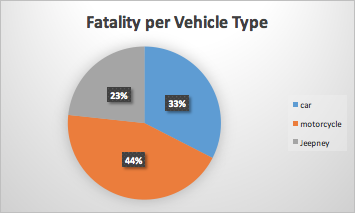 Before: One group created this pie chart in their first attempt to illustrate the types of vehicles most likely to be involved in fatal road crashes. In this chart, it’s not clear what “whole” the pie represents.
During the workshop, the group received feedback that the “whole” represented by this pie chart isn’t clear. Is the chart saying that 23% of fatal incidents involved jeepneys? Or does the chart say that 23% of incidents involving jeepneys were fatal? Those are two different things!
To show which vehicles were more dangerous than others, the group replaced this pie chart with a 100% stacked bar chart, which is useful for comparing ratios across different categories:
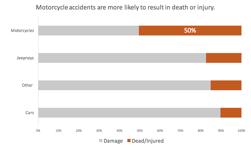 After: Stacked bar charts are great for comparing ratios across multiple categories.
This chart type better enables the viewer to compare ratios across vehicle types. The group also chose a stronger color to represent the ratio of incidents involving each vehicle type that resulted in death or injury. Sorting the bars by this metric puts motorcycles clearly on top. The use of a horizontal instead of vertical bar chart also makes it easier to read the labels on the left.
Makeover 2: Write meaningful chart titles and labels
Another group learned that most road crash victims were young adults in their 20s and 30s. To visualize this, they first produced a histogram showing the distribution of victim ages across five-year age groups:
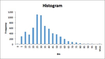 Before: Microsoft Excel makes it easy to generate a chart with a few clicks of a mouse. But there’s a world of chart magic available beyond the default settings!
There are a few things that can be improved in this chart. First, the title and axis labels don’t help the user interpret the chart. In fact, the bar labels along the horizontal axis are potentially misleading. The bar labelled “5” doesn’t actually refer to victims that are five years old, but to victims ranging from 0 to five years old.
Here’s an improved version of the same chart:
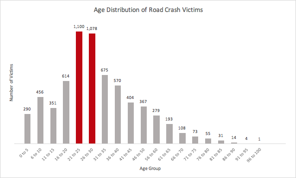 After: Charts may be visual tools, but are useless without meaningful and accurate titles and labels.
Accurate labels make this chart less prone to misinterpretation. The chart also uses color to direct the viewer’s attention to the top two age groups.
Makeover 3: Increase data-to-pixel ratio
Another group wanted to show that road accidents peaked during two months in 2007: July and December. Their first chart featured bright blue bars and a thin, dotted trend line against a black background:
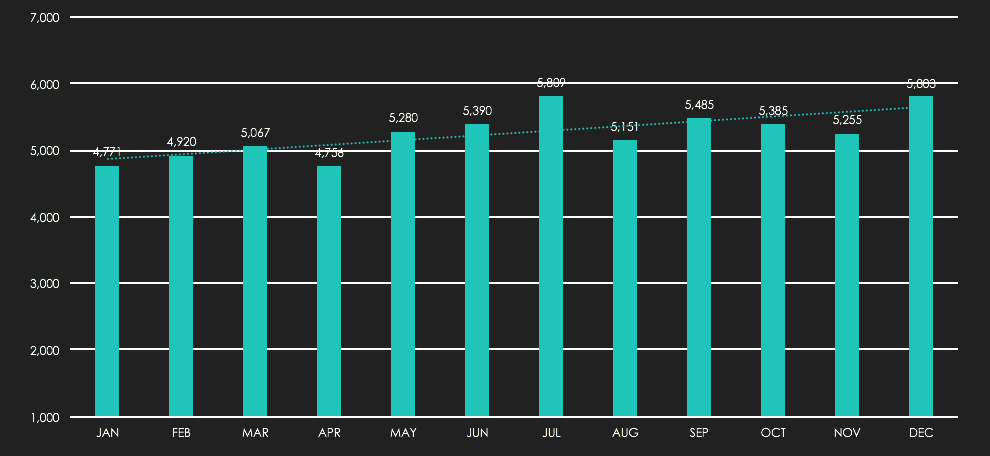 Before: Use black backgrounds with caution! They may make your chart appear more visually heavy than necessary.
Data visualization experts often say that well-designed charts should have a high “data-to-ink ratio,” a concept first coined by information design pioneer Edward Tufte. Increasing a chart's data-to-ink ratio (or data-to-pixel ratio, if you're working with a digital medium) requires eliminating colors, lines, shapes, textures, or any other visual elements that don’t convey meaningful information.
The data-to-pixel ratio of the above chart can definitely be increased. Light backgrounds are usually easier on the eyes than dark ones. Also, it’s redundant to use a labelled y-axis with grid lines and label your bars directly. Either approach is acceptable, but best to just choose one. Here are two possible revisions:
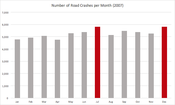 Makeover option 1: Use light grid lines and a labelled y-axis.
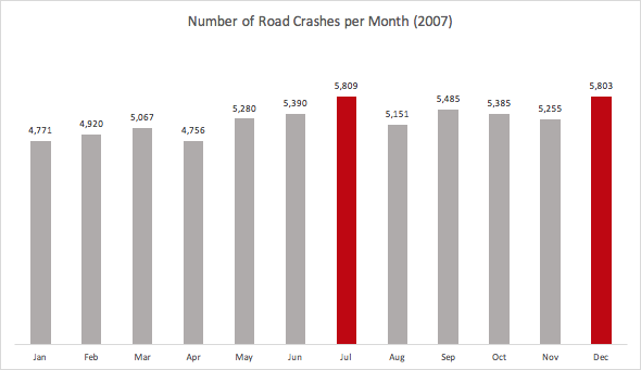 Makeover option 2: Label your data directly to eliminate the need for a labelled y-axis and grid lines.
While some will argue that trends over time are better represented using a line chart, in this case, the bar chart is a reasonable choice given the group’s intention to highlight July and December.
Another not-so-obvious problem with the original chart: the minimum value of the y-axis was 1,000, not zero. There are occasions when not starting a bar chart's y-axis at zero is appropriate, but doing so distorts the visual relative heights of the bars. Use with extreme caution! The revised charts above both use y-axes that start at zero.
Makeover 4: Use labels to eliminate legends
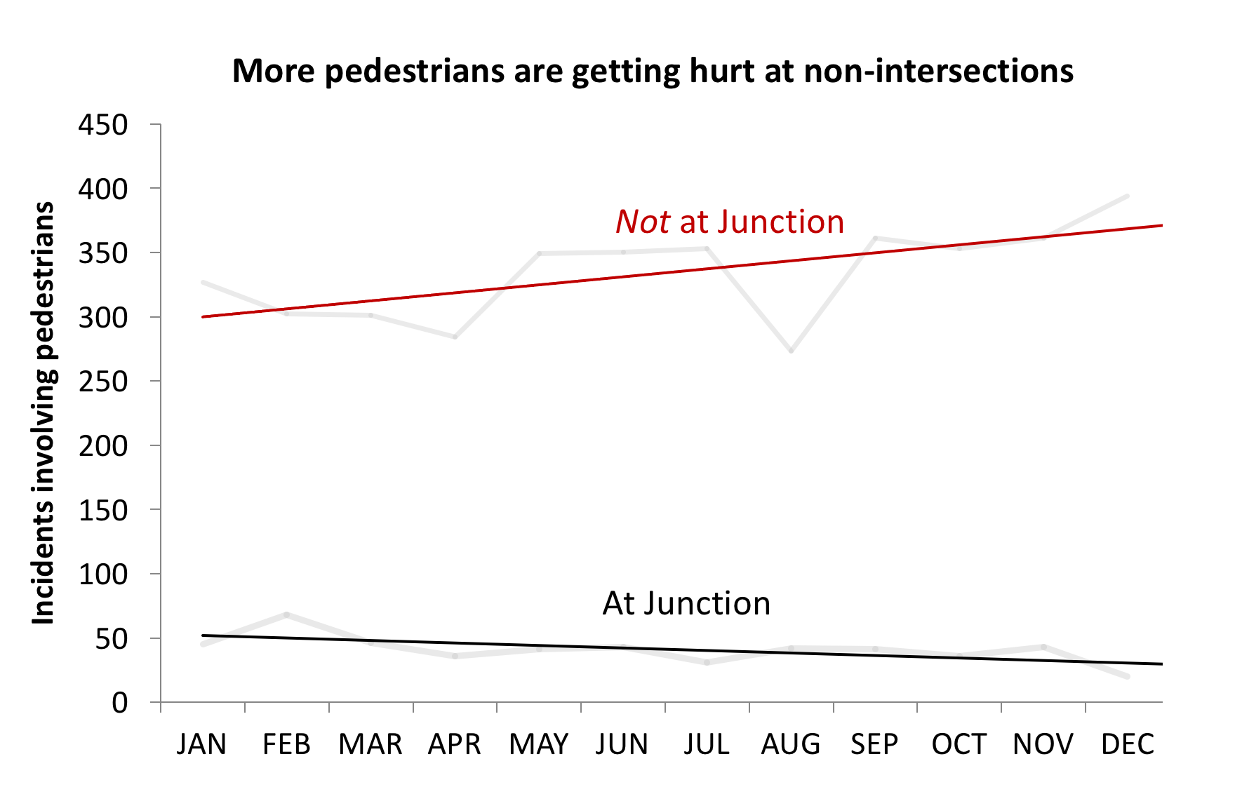
Another group of data detectives discovered that, contrary to intuition, traffic incidents involving pedestrians rarely happened at intersections. To illustrate the slightly rising number of pedestrians getting hit at non-intersections, the group first produced this chart:
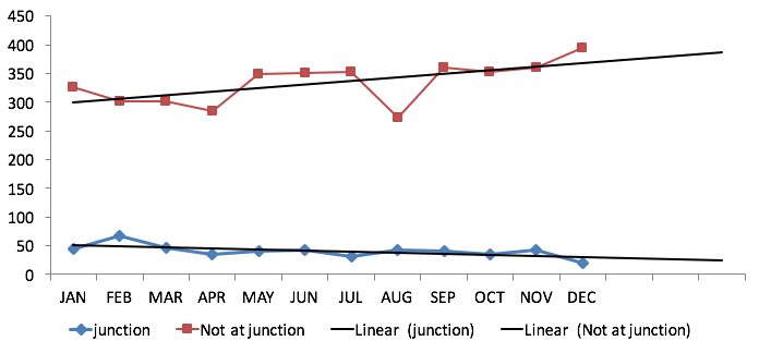
This chart requires the viewer to look back and forth between the legend and lines. The line markers also make the chart look busier than necessary.
To eliminate the need for a legend, the group directly labelled the lines. To emphasize the contrast between the diverging trends, they darkened the trend lines and lightened the lines representing the month-to-month figures. Add some meaningful titles and labels, and you have this result:
Makeover 5: Use an appropriate color palette
Another group wanted to show at what times and weekdays most accidents happen. They chose a more novel form of data visualization – the heat map. Easily done in Excel, heat maps use color intensity to show the strength of correlations between two sets of variables.
The group's first heat map used a green-to-red color scale. Color scales that move between two opposite hues are often called "diverging palettes," and are useful for data “where both low and high values are interesting.”
 Before: This heatmap uses a green-to-red color palette to indicate low-to-high data points.
This initial color palette wasn’t quite suited to the data, since the group wanted to focus attention on where there are a lot of accidents, not very few. Also, it didn’t quite make sense to use green to indicate areas with relatively fewer accidents, since even a low number of accident should be a cause for concern.
In their revised chart, the group used a yellow-to-red sequential color palette. Sequential color palettes use varying intensities of a single hue or two very similar hues to visualize data that ranges “from relatively low or uninteresting values to relatively high or interesting values."
When do most road accidents take place?
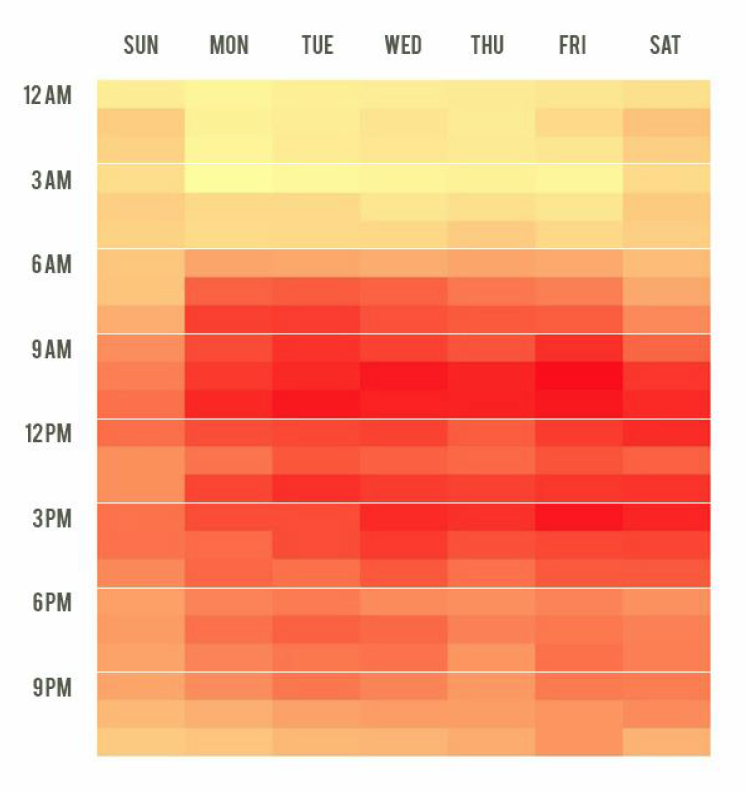 After: A sequential color palette is more appropriate for data sets in which the relatively higher values are notable.
To focus viewers’ attention on the relative differences rather than on the actual figures, the group also removed the numbers from the cells. They also added white breaker lines between three-hour periods to improve readability.
To wrap up, these makeovers illustrate some useful rules of thumb you can apply when making your own charts:
- Use a pie chart to show composition of a whole, but consider a stacked bar chart to compare composition across multiple variables.
- Don’t forget to write meaningful chart titles and axes labels.
- Use color to direct attention, not just to decorate.
- Increase data-to-pixel ratio by removing unnecessary elements. Try a light background instead of a dark one. Labelling your data directly can eliminate the need for some axes, grid lines, or legends.
- When making a heatmap, use a diverging color palette if both very low and very high values are important. Use a sequential color palette when only very low or very high values are important. Be mindful of the intuitive associations people make with certain colors.
When it comes to turning good charts into great ones, small tweaks can make a big difference.