Making Panel Discussions Memorable with Data Visualization
January 31, 2017
Minutes are the default method of documenting and summarizing meetings. But they’re also about as interesting to read as an instruction manual.
The Oscar M. Lopez Center (OML Center), a nonprofit foundation that funds climate change and disaster risk reduction research, occasionally hosts round-table discussions on scientific topics, but struggles to keep participants engaged after the round-table is over.
“We wanted an innovative way of documenting our technical discussions. Beyond a traditional event report, the OML Center envisioned a stimulating visual that could highlight the most salient issues of the forum and be used as a tool to inform succeeding discussions on disaster risk finance and insurance,” said Marianna Vargas, the OML Center’s Project Coordinator.
With this in mind, the OML Center asked our data storytelling team at Thinking Machines to visualize a breakout discussion that would gather dozens of experts from academe, civil society, and government to share ideas on disaster risk financing. Held on Nov. 8 2016 at SMX as part of the ARISE Leaders Forum, the breakout discussion focused on how science and technology could create financial systems that would better account for potential disaster-related losses and damages.
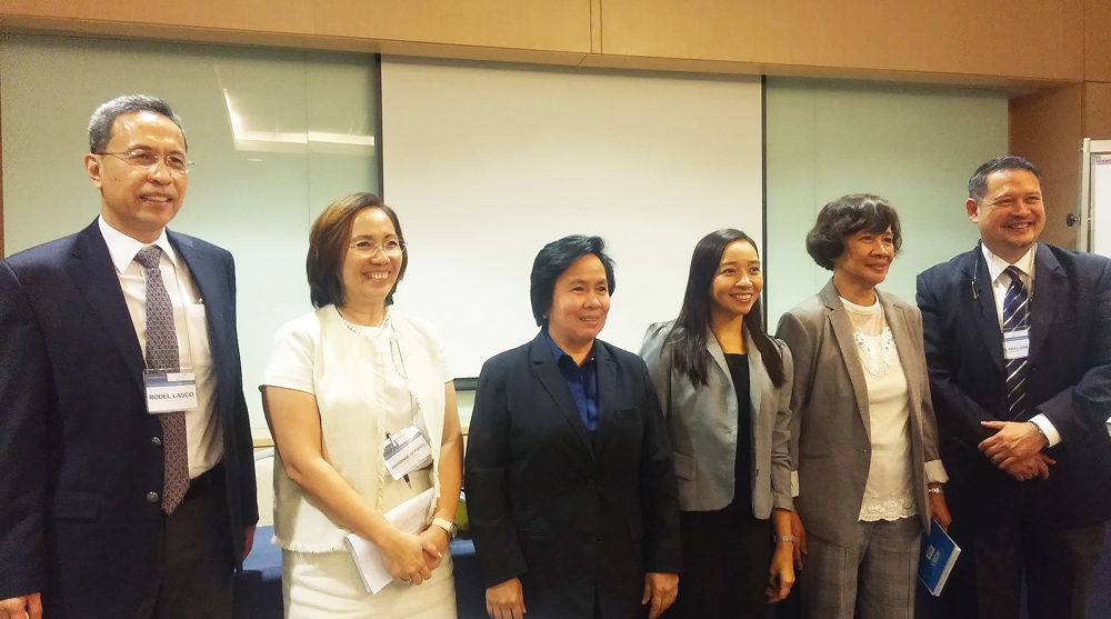 From left to right: Dr. Rodel Lasco, Marianne Quebral, Catherine Maceda, Cherry Lorenzo, Dr. Lourdes Tibig, and Mitch Relosa, panelists from OML Center’s November 8, 2016 breakout discussion on disaster risk financing.
It was an interesting and unique challenge to enforce quantitative structure on something as organic and qualitative as a topic discussion. While word clouds are one of the most common ways of displaying text data, they only reveal the relative frequency of words in a text, but don’t reveal much more insight. Our team wanted to use visualization techniques to both highlight the most important topics and serve as a blow-by-blow record of the event.
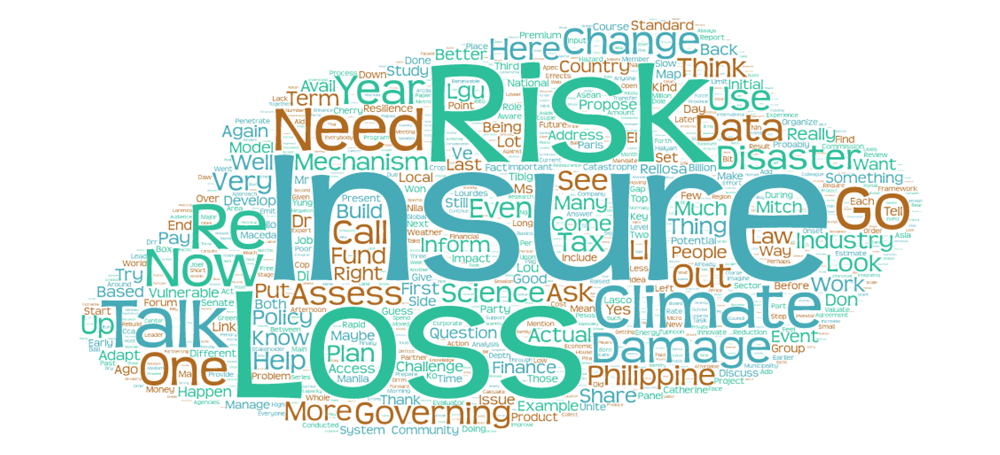 A word cloud of this article produced with http://www.tagul.com/.
Challenge 1: Quantifying Words
Our first task was to figure out how to organize and quantify the discussion information in a meaningful way. One source of inspiration was this blog post on Medium by Belgian information visualization teacher Sven Charleer, who asked his students at KU Leuwen to develop interesting ways of visualizing classroom discussions.
We outlined some of the discussion metrics we thought would be most useful to the event participants and organizers. These included:
- Who spoke?
- What topics did they talk about?
- How long did they speak?
- How did the audience react to these topics?
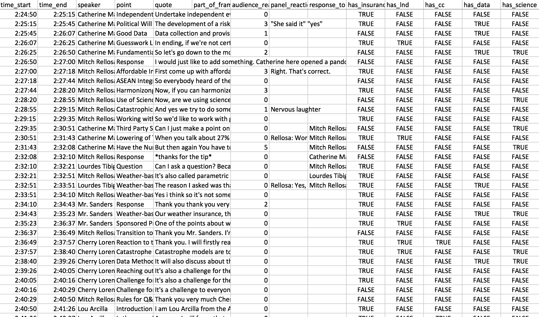
After identifying what to measure, our designers captured and transcribed an audio recording of the event. During transcription, they used word counts to categorize chunks of the text by topic. They took note of who spoke, for how long, and how the audience reacted. The resulting dataset was a spreadsheet that looked like this:
Challenge 2: Building Cool Visuals
After the data was encoded, it was time to visualize it. Our designers drew initial inspiration from “sparklines,” a method of diagramming presentations, which was developed by communications expert Nancy Duarte. Our initial design involved a vertical timeline of the discussion. Each chunk of the timeline was labelled by topic and used different colors to represent different speakers. The horizontal distance of each bar from the left axis corresponded to the intensity of the audience’s reaction:
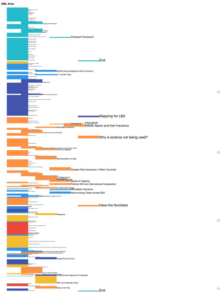
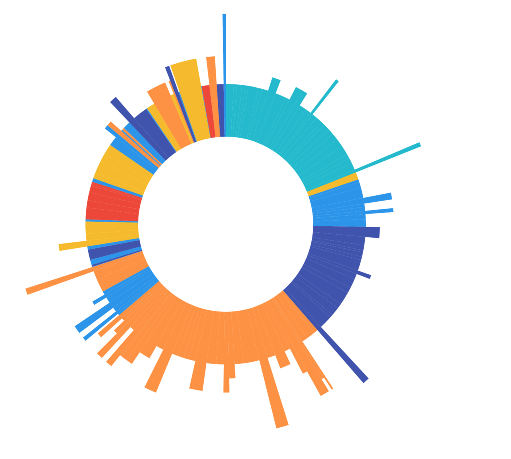
This initial layout proved difficult to read, however, and the vertical orientation created an awkward shape. To solve these problems, we moved to a circular layout, which could be read like a clock:
The Final Product
This layout worked in both portrait and landscape orientation, and could easily accommodate additional visual elements. To reduce the need for text, our design team used color to signify different topics. Here’s the final graphic, including labels and annotations:
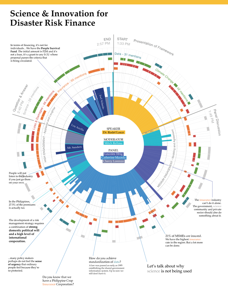
The resulting visualization allows anybody to see, at a glance, the amount of time allocated to different topics and speakers, and the different levels of audience engagement they received. An interactive version of the graphic also allows users to read the actual parts of the transcription that correspond to different parts of the circular timeline.
"The visualization has provided valuable input to the Center's research agenda by conveniently identifying the most crucial challenges confronting our stakeholders in the area of disaster risk finance and insurance. This kind of data presentation has also enhanced the Center’s capacity to uniquely communicate the underlying challenges in addressing climate change and climate-related disasters," said OML Center’s Vargas.
We’re glad there are organizations like the OML Center who are willing to explore novel applications of data visualization. Does your organization have an interesting design challenge that we can help you solve? Say hi at [email protected]!