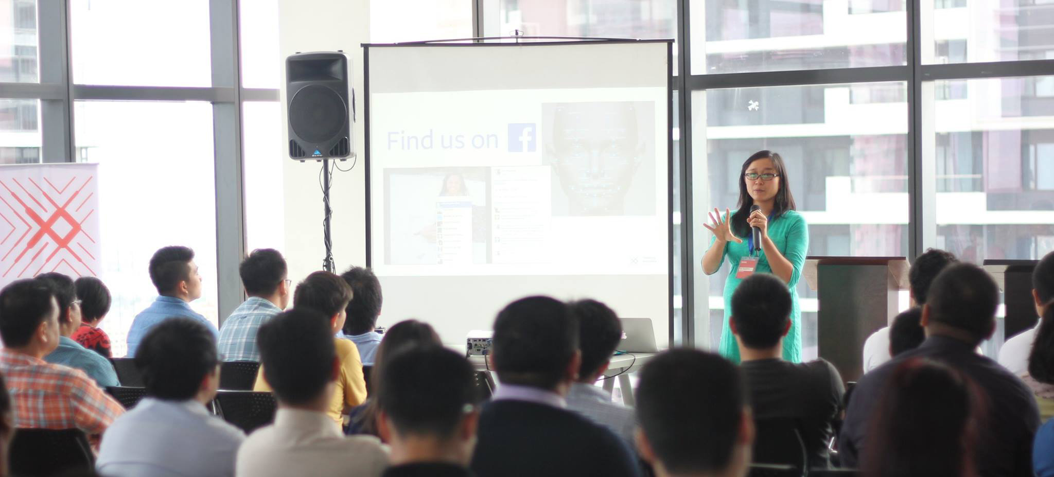
Dots are people too: Learnings from Information+
July 12, 2016
Last month, we had the remarkable opportunity of sending our Data Designer, Mika Aldaba to the inaugural Information+ Conference in Vancouver, Canada. Information+, held from June 16 to 18, 2016, was a three-day series of talks and workshops on data visualization held at Emily Carr University of Art and Design. The event is one of the few data visualization related conferences that targets both researchers and practitioners. Mika writes about what she learned from attending the conference.
Rainy beginnings 10,541 km away from home
My first few days in Vancouver were rainy, even though it was supposed to be summer. On the day of the conference, the sun finally decided to show its face. The stage was set for the top beacons of data visualization to shed more light on their work. These were people whose work I’ve been following online since I got into the practice. The number of data heavyweights that were set to speak at Information+ made it easy to convince my boss to send me to the conference. Every year, the demand for data specialists exponentially increases with the amount of data we have. Conferences like Information+ provide a rare venue for communication and design professionals from around the globe to discuss the questions and challenges arising from this rapidly changing field.
I was not only representing our company, but also my country. The Philippines barely has any designers who specialize in data visualization. Southeast Asia has no data visualization conferences that I could attend. The closest would be PacificVis, which was held in Taiwan this year, but is more geared towards the academia than industry.
Talks by Industry
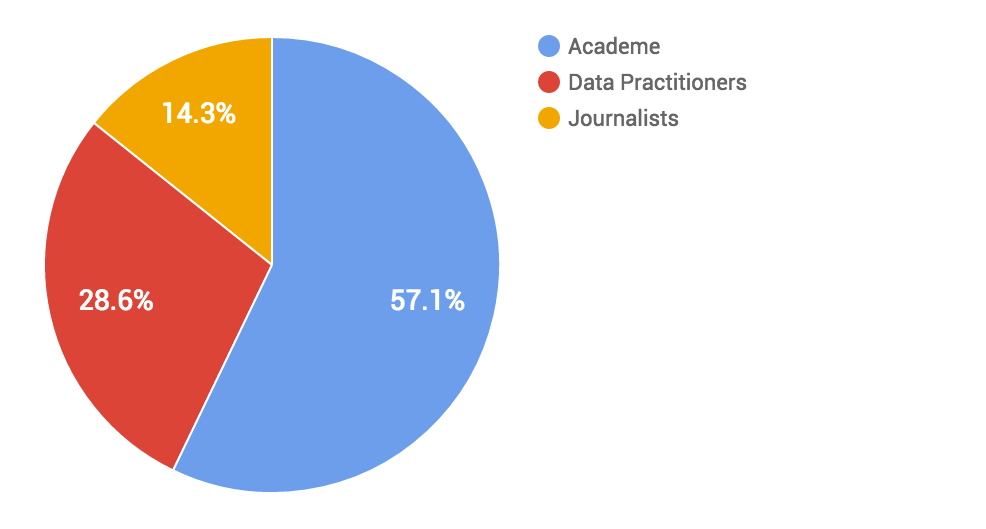
Speakers by Country and Gender
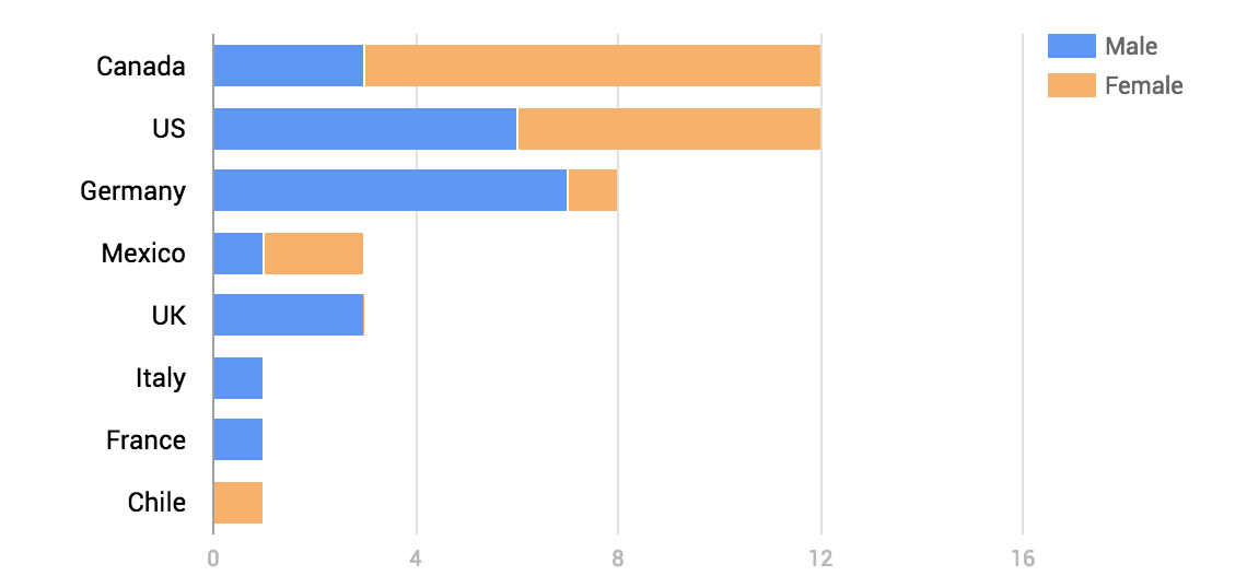
That said, it was well worth travelling across the Pacific to attend Information+. There were so many talks crammed into the sessions that I was overwhelmed with information by the end of the conference. I feel like I really got value out of the cost of attending.
Data Visualization as a Science
Tamara Munzner, Professor of Computer Science and head of the InfoVis Group at the University of British Columbia, established in her keynote address one of the overarching themes of the conference. She presented a framework for data visualizations that elegantly pieces together concepts from different design disciplines in a way that I’ve been practicing intuitively, but never knew how to put into words. Her framework provides a practical way of diagnosing why a particular data visualization is ineffective and how to correct it. It’s easy for anybody to click a button and generate a chart, but good data visualizers understand the underlying rules to the practice.
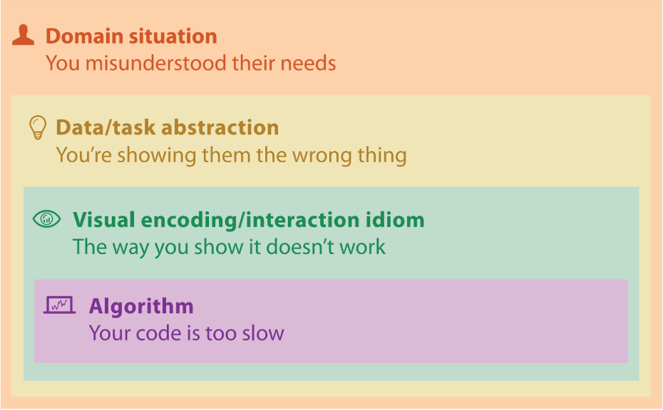 At which level did the visualization go wrong? View Tamara Munzner's slides here
Kim Albrecht, a visualization researcher at the Center for Complex Research in Boston, gave a talk about the design process. Quoting French philosopher and sociologist Bruno Latour, Albrecht described the design process as a “drawing together”, or, simply put, as a synthesis of many different things. He compared design process to the scientific process. Both involve a lot of experimentation to achieve the desired result. However, while design is a “drawing together,” science is a “distilling.” In contrast to others, whose design philosophy is to simplify and reduce, Kim adds more and more layers. His Untangled Tennis visualization places a tennis player’s “fingerprint,” a radial transformation of his tournament value graph, into a scatter plot. He draws together many different things in his design: tennis, math, performance, Wikipedia and popularity.
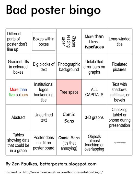
Professor Karen Cheng from the Visual Communication Department at the University of Washington talked about the value of visual design in scientific communication. Her talk reminded me about a conversation that I had with my boss about how much we could learn from academic papers if we could only decipher their lingo. Visualization can help bridge the communication gap between scientists and the public. Scientists who shy away from design should realize that good visualizations actually make them seem smarter to their readers. Karen also introduced us to this gem:
Pie charts aren’t evil and people don't interact with interactives
Some data visualizers are even using data to test long-assumed best practices in the field.
I had been looking forward to a talk by Robert Kosara, @eagereyes on Twitter and researcher at the data visualization software company Tableau, in which he promised to defend pie charts. He did not disappoint. A lot of data visualization experts discourage the use of pie charts, arguing that people cannot easily distinguish the size differences between pieces of a pie chart. Kosara reminds us that data visualization is not a cult and should be treated more like a science. Rules of thumb should regularly be challenged and tested. He changed a lot of people’s minds on a controversial topic by presenting evidence showing the readability of pie and donut charts.
In an experiment conducted by the research team at Tableau, around 80 to 100 people were tasked to estimate values of pie and donut charts based on size, arc length and angle. Most people could correctly estimate the values represented by a pie or donut chart when they focused on the size or arc length of each piece, but estimated incorrectly when they focused on the angle size.
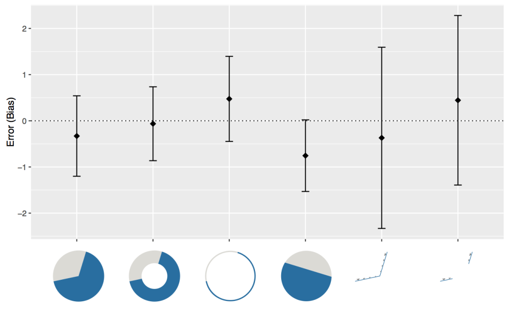 You can read more about Robert Kosara’s research on pie charts on his blog.
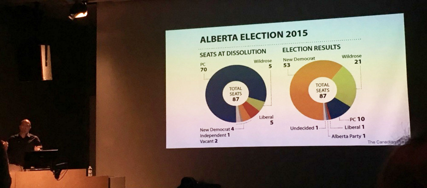 Robert Kosara’s example of a donut chart well done
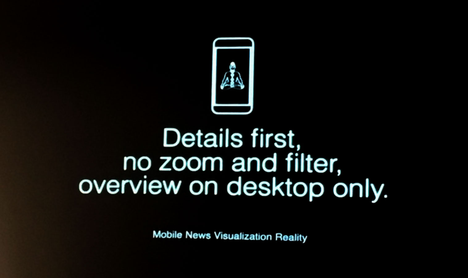
New York Times data journalist Gregor Aisch shared one of the most shocking things I learned at the conference – that people don’t click on interactive data visualizations. The NYT logs show that only ~10% of users play with interactive graphics. For all the work that goes into developing interactives and the reception that they get from other designers, this number is quite low. Could the resources spent developing interactives be better spent on improving static graphics?
At Thinking Machines, we haven’t implemented an interactivity tracker yet, but we did notice a huge engagement boost from using animated GIFs on our social media posts. Perhaps that can be something to look into further. We must constantly test and revise our methods to see how people respond to our work. It doesn’t end after we hit publish. We need to measure the impact of our output.
 Paradigm shift
Gregor Aisch drew heavily from principles in Professor Colin Ware’s book, Visual Thinking for Design, when he designed this complex 3D yield curve graph last year. Luckily for me, Ware, also director of the Data Visualization Research Lab at the University of New Hampshire, was another keynote speaker at the conference. His presentation was a literal eye opener. His studies look into human sight, how our eyes interpret visuals. I am ashamed to say that I haven’t read Ware’s books yet, but several attendees advised me to rectify the situation immediately.
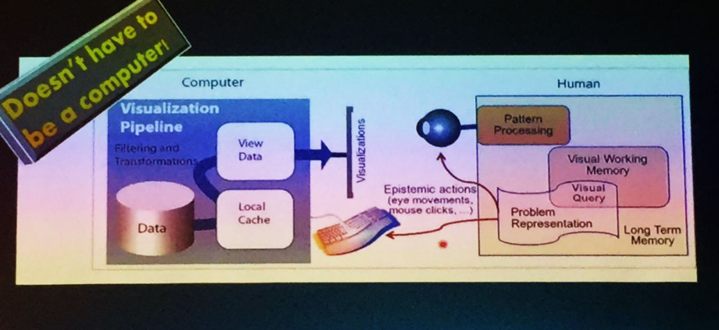 Visual thinking is a complex process.
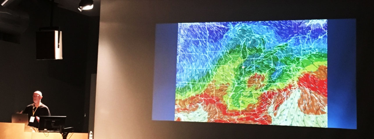 Rainbows are also ok again. Colin Ware explains that the rainbow was the only palette that contained 20 identifiable color shifts.
Data Visualization for Public Good
Another dominant theme of the conference was how data visualization can be use for education and even activism.
My personal favorite talk was by Catherine d’Ignazio, Assistant Professor of Data Visualization and Civic Media at Emerson College in Boston. D’Ignazio’s research focuses on how data visualization can promote civic engagement. I was particularly struck by her quoting from the Pedagogy of the Oppressed, a book by Paulo Freire, a Brazilian educational thinker. It was something I didn’t expect to hear at a design conference.
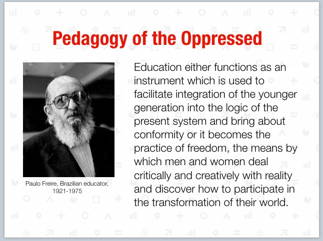
The quote resonated with me on an emotional level as I recalled how, during the recent election campaign period in the Philippines, I noticed a lot of Filipinos sharing articles that used unverified data. It made me reflect the need to integrate data literacy and critical thinking into our educational system.
D’Ignazio talked about the concept of data visceralization, or how to make data be felt. She showed us a project of hers in Boston visualizing the predicted future coastline after climate change. As sea levels along the East Coast of the United States rise three to four times faster than the global average, a significant part of Boston, a coastal city, will be submerged. Instead of just making a normal map, she got 30 volunteers to walk along the actual coastline that will be underwater. Passersby were invited to participate with them and lend their own voice to the mini-parade.
 Experiencing climate change data
Later during the day, I approached her to ask about how to solve the lack of data literacy in a country like the Philippines. She replied that while promoting data literacy might be out of the usual scope of data visualization, I could still do something about it. She advised me to do more interviews and ground work to find out the real cause of the problem. Data journalist Chad Skelton from the Vancouver Sun reminded us in his talk, How to Think Like a Data Journalist, that there are people behind the data and that we should “pick up the phone and talk to them.”
There were several other talks that I felt were relevant to my context as a designer in a developing country. Heather Krause from the Toronto-based NGO Datassist explored the ethics and best practices of collecting data in developing countries.
Manuela Garreton, a professor at Pontificia Universidad Católica de Chile, talked about a project she did with the Ciper Journalism Research Center in Chile in which they visualized conflict-of-interest relationships between Chilean politicians and corporations. I asked her if she had ever gotten into trouble for producing such a politically-charged visualization and she said that Chile is pretty transparent. This is exactly the kind of data project that the Philippines should have, though I’m unsure if it would be met with no resistance at all.
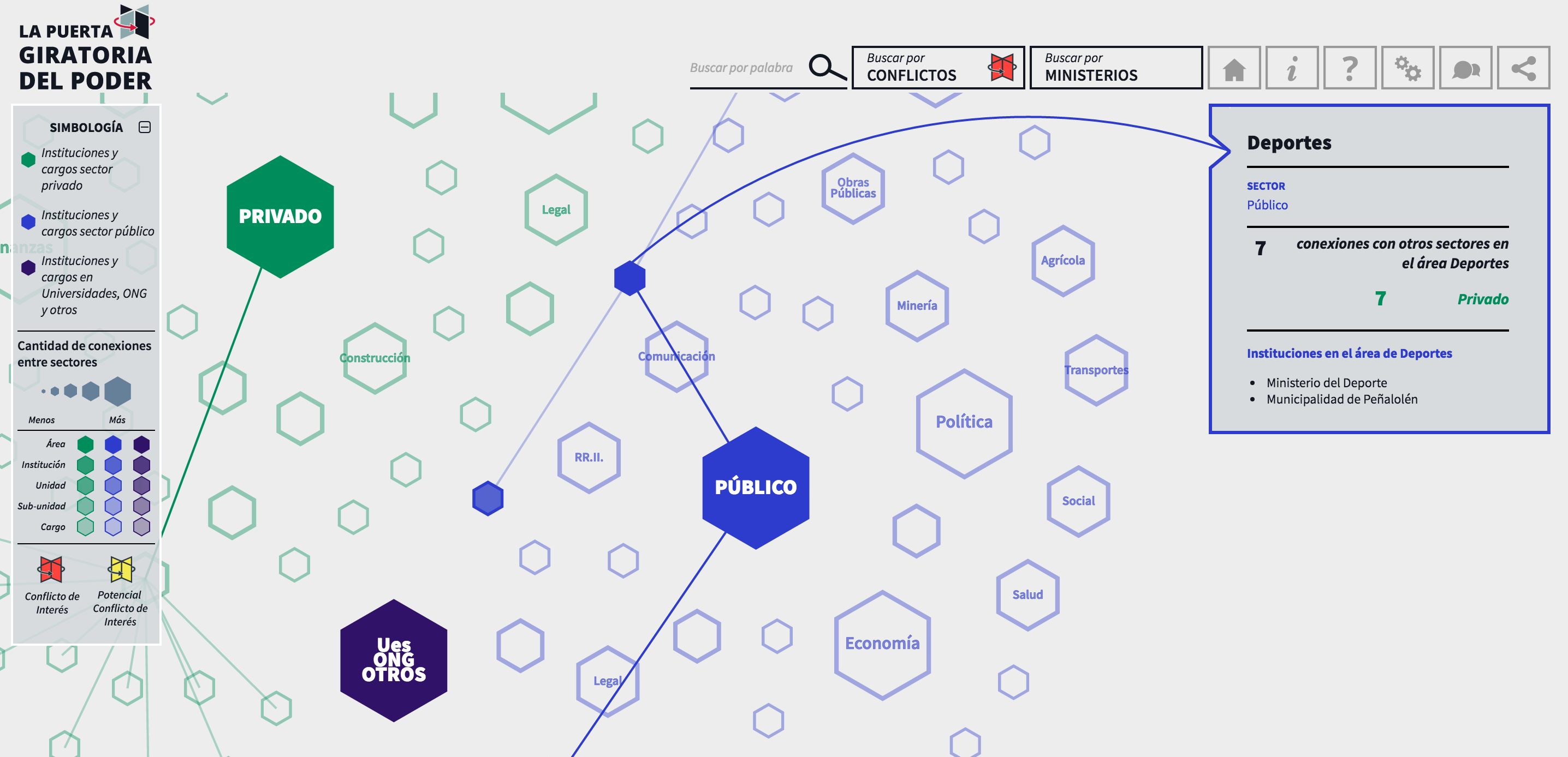 Conflict of interest visualized
Data is often seen as an objective source of information, but data design almost always requires subjective choices. A number of speakers talked about this. Yanni Loukissas, who turned out to be my friend’s professor in Georgia Tech, argued that should always take note of how data was collected because this can influence how it should be interpreted. Alice Thudt, PhD candidate at the University of Calgary, presented very personal and subjective data visualization projects. Even the act of cleaning data can get subjective. Valuable insight can sometimes be found in messy data, so we should be aware of our biases when we decide how to clean data.
Jonas Parnow, an information designer based in Berlin, shared the aftermath of his student project, Airbnb vs. Berlin, a website that visualizes the impact of the sharing economy on the availability of affordable housing in Berlin. Barely minutes after the site went live, Airbnb contacted the creators to ask how they got their data and to offer them jobs. A few Airbnb hosts even threatened to sue the designers. The page went viral and was featured in several websites, including Wired. Jonas and his team were surprised by how many people assumed that the website designers were all-knowing experts on the topic. “The act of visualization becomes a political statement,” he says. “Therefore we should wrangle data responsibly and mind our audience.”
Patricio Davila, a designer and Assistant Professor at OCAD University in Toronto, argued that data visualizers can help people understand and eventually change the status quo. He shared about an anti-eviction mapping project that used data visualization to show how the tech boom has indirectly led to the eviction of thousands of underprivileged San Francisco residents. The website humanizes the data, linking charts to the displacement narratives of actual people. Visualization should give a voice to everyone, not just the elite.
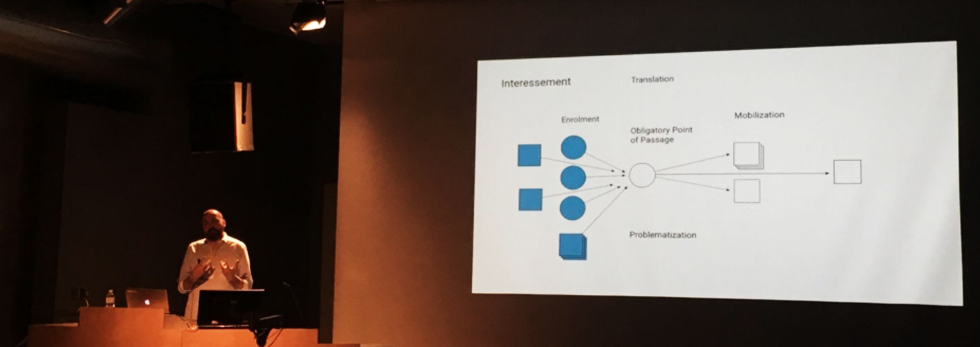 Bruno Latour’s theories are mentioned for the second time in the conference during Patricio Davila’s talk.
The Humans Behind the Data Visualizations
 Here I am (center) with data visualization “giants” Andy Kirk @visualisingdata, Moritz Stefaner @moritz_stefaner, and Gregor Aisch @driven_by_data, on whose shoulders I wish to stand someday.
At the last minute, I printed some postcards of our Philippine election cartograms to hand out to people who asked about what I did. I was a bit worried that I would seem too pushy, but in hindsight, it was an effective icebreaker and allowed me to tell people a little about our country.
During the breaks, I summoned up the courage to speak to some people I followed on Twitter, like Robert Kosara (@eagereyes). He pointed out Jim Vallandingham (@vlandham) from Bocoup, a web development firm and organizer of the OpenVis conference, whose scroller.js I was currently learning to use. I was in the good company of fellow nerds who also dressed nicely.
I’m noticing that #InfoPlus2016 has a much higher ratio of cool shoes than most conferences. Probably due to all the designers.
— Noah Iliinsky (@noahi) June 17, 2016
These were the humans whose work I admired. They were also gracious enough to entertain my questions. There were probably twice as many speakers as there were participants. If I talked to someone at random, the person usually turned out to be either a speaker or exhibitor. It was particularly fun to socialize with them after the conference. The topics of conversation were on data, politics and our life experiences.I’m happy to have met more professionals in this small but growing field of data visualization.
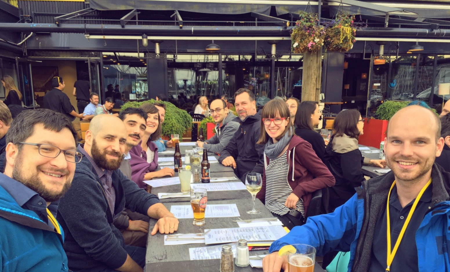 Table for how many? The receptionists at the nearby restaurant were overwhelmed by around 30 attendees who went for a post conference drink.
Noah Iliinsky (@noahi), Yanni Loukissas (@yloukissas), Michele Mauri (@mikima), Alice Thudt (@al_ice_t), Dominikus Baur (@dominikus), Georges Hattab (@georgesvis), Roger Fischer (@datamapio), Lisa C. Rost (@lisacrost), Benedikt Brink (@bgbrink)
Data visualizations as shiny beacons of hope
With the shadows of political and natural disasters looming like dark clouds in the distance, one can’t help but feel anxiety for the future. One way we can cope is to use our data visualization tools for good. Klaus Kremer, an interactive designer based in New Zealand, presented his designs for a tsunami warning and education mobile app. He designed the app to have two modes -- dormant and active. During the active mode, which turns on during a disaster, the mobile app is designed to be especially easy and intuitive to use, since people might have difficulty interpreting warnings during stressful situations.
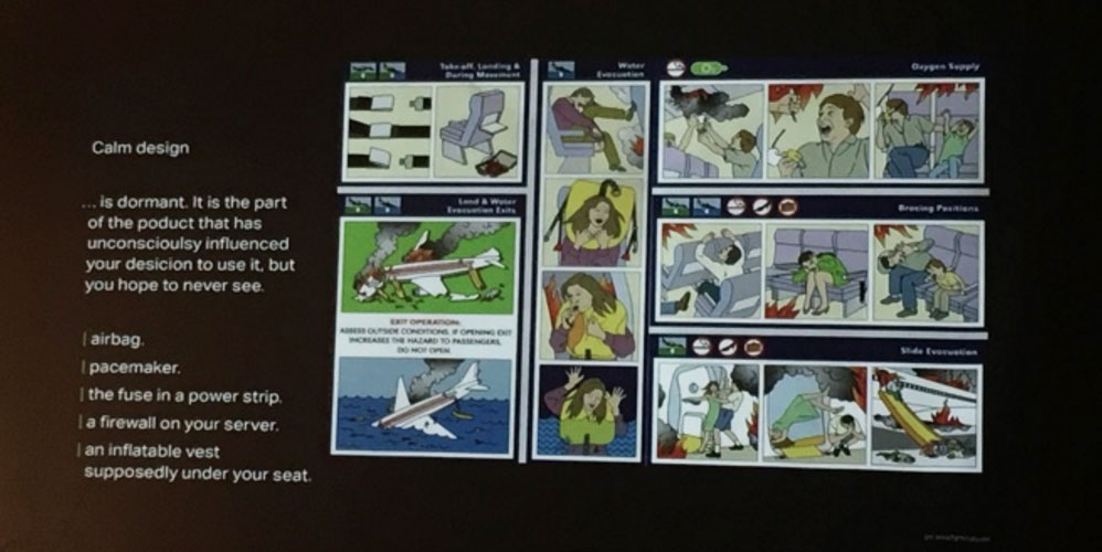 Klaus Kremer: design in case of emergency
Drew Hemment and Moritz Stefaner’s Project Ukko was the most aesthetically pleasing case study for me. Project Ukko is a seasonal wind prediction visualization for decision makers in the clean energy sector. The visualization was not only available as an online application but also as a video, interactive exhibit, and ambient display. Being immersed in the animated installation at the Information+ exhibit was an inspirational experience. I have always been influenced by Moritz Stefaner’s style and I was ecstatic to finally have met such a talented designer.
At Thinking Machines, we had a hard time deciding what my job title should be, but we eventually settled on “Data Designer.” While this describes what I do on a day-to-day basis, I can’t help but be inspired by the job title that Moritz chose for himself: “Truth and Beauty Operator.” Those are qualities that all data visualizers aspire to achieve in their work.
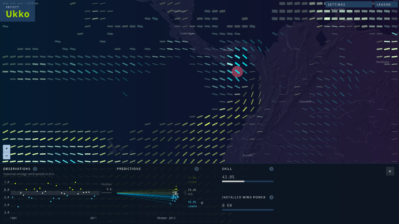 Project Ukko: A multi-level wind visualization
In a world where rational thought is being substituted for emotional decision-making, the work of communicating facts is ever more important. It is our moral duty as designers to shed some light on the ugly, messy and complex truth as beautifully as we can.
For those interested in attending the conference in the future, please follow @InfoPlusConf on Twitter. We paid C$315 for an early bird conference-only ticket. We recommend this conference and will definitely try to go again.
