This is what 24 hours of Metro Manila holiday traffic looks like
Dec. 23, 2016
Has Metro Manila’s holiday traffic been naughty or nice this year?
People often complain about traffic congestion during Christmas time. But now, Metro Manila’s transport planners have access to wealth of real-time data that reveals exactly where, when, and how bad the traffic can get.
The Metropolitan Manila Development Authority (MMDA) has recently joined forces with Waze to exchange data about traffic conditions in Metro Manila. In exchange for providing Waze with information about upcoming road closures and traffic incidents, MMDA now has access to real-time, crowdsourced traffic data from Waze’s 1-million-plus users in Metro Manila. The program is part of Waze’s worldwide Connected Citizens Program.
We’re currently working with the MMDA to analyze Waze data. As a first foray, we’ve produced this nifty 24-hour timelapse of evolving traffic conditions in Metro Manila last December 16, the payday Friday preceding Christmas weekend.
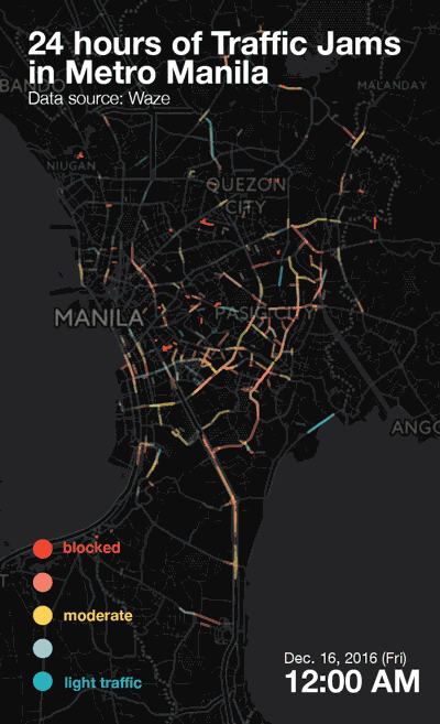
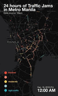
The timelapse1 stitches together 15-minute2 snapshots of our traffic last Friday. The colors on the map represent different Waze traffic congestion levels, ranging from 1 (“light”) to 5 (“blocked”). The blue lines represent lighter traffic, while red lines represent very heavy traffic. Darker, more opaque lines show roads where traffic jams are relatively more frequent.
Before its partnership with Waze, the MMDA’s traffic data was limited to what its personnel could visually monitor via 150+ CCTV cameras placed along major corridors in Metro Manila. With Waze data, the MMDA can now monitor real-time speeds and hazards on almost every street in Metro Manila 一 all day, every day.
While we’re still working with the MMDA to determine how this data can be used to inform transport policy, this quick-and-dirty 24-hour timelapse already shows the busiest routes and peak hours.
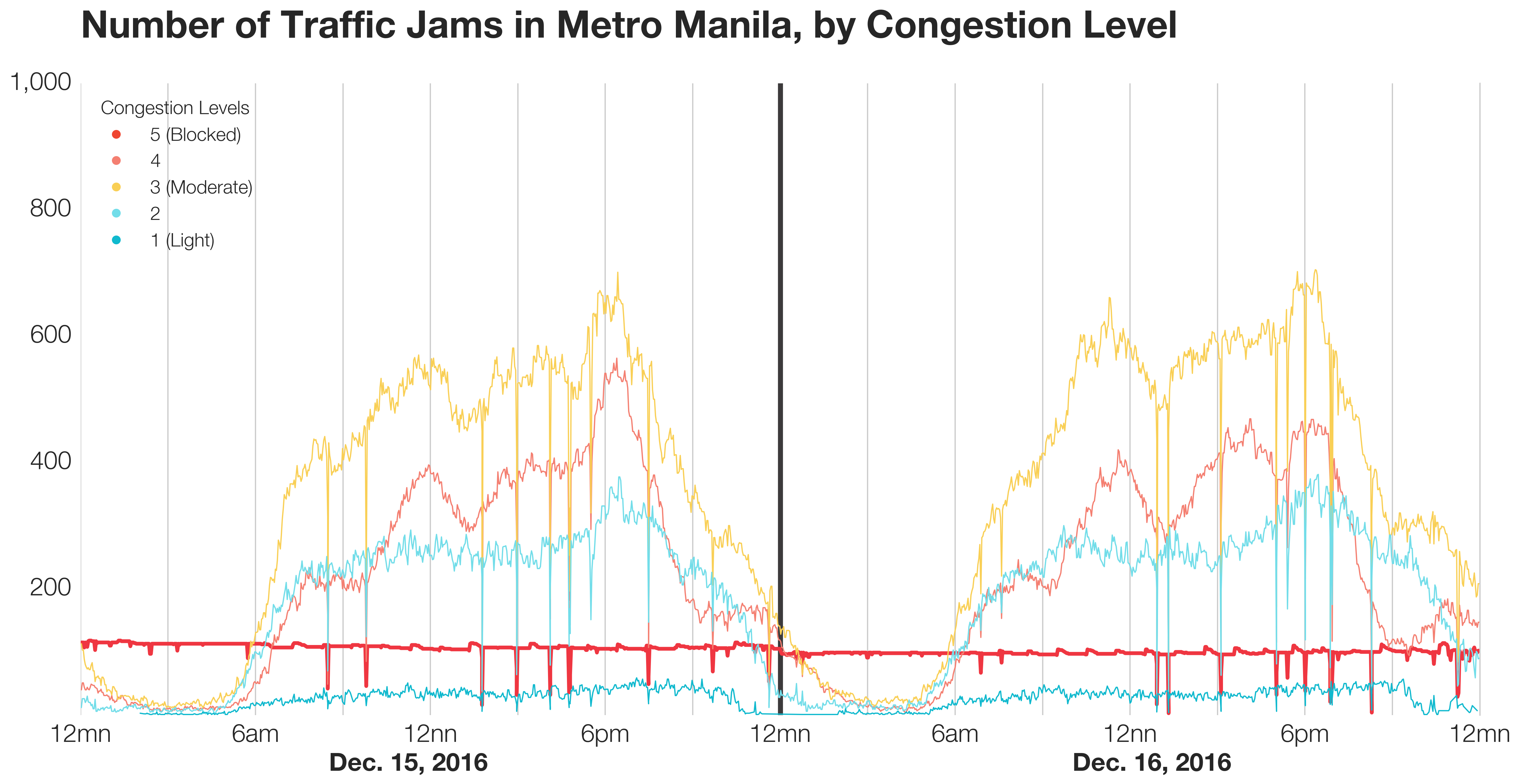
The line plot below also shows how total traffic jam volume changed over the 48 hours between Dec. 15 and 16. Conventional thinking has always told us that traffic peaks during the morning and evening rush hours, but these plots show that traffic actually increases steadily throughout the day, with peaks just after 12 noon and 6PM.
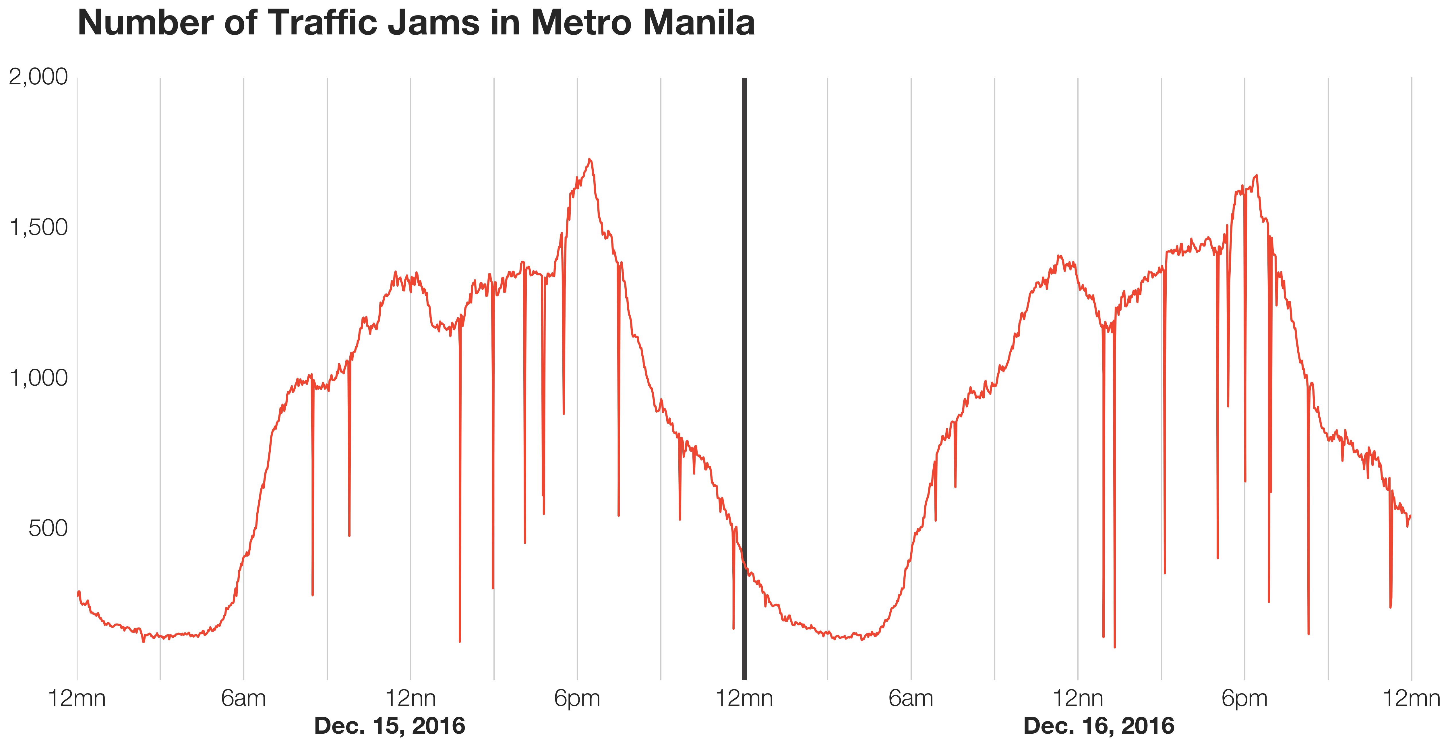
Note that a single traffic jam (e.g., caused by road blocks) can last a day or more, and that the drastic drops are probably caused by data collection peculiarities.
But what if we break down the traffic jam count by traffic congestion level? To show this, we made a stacked area chart to show both composition and magnitude of traffic volume over time.
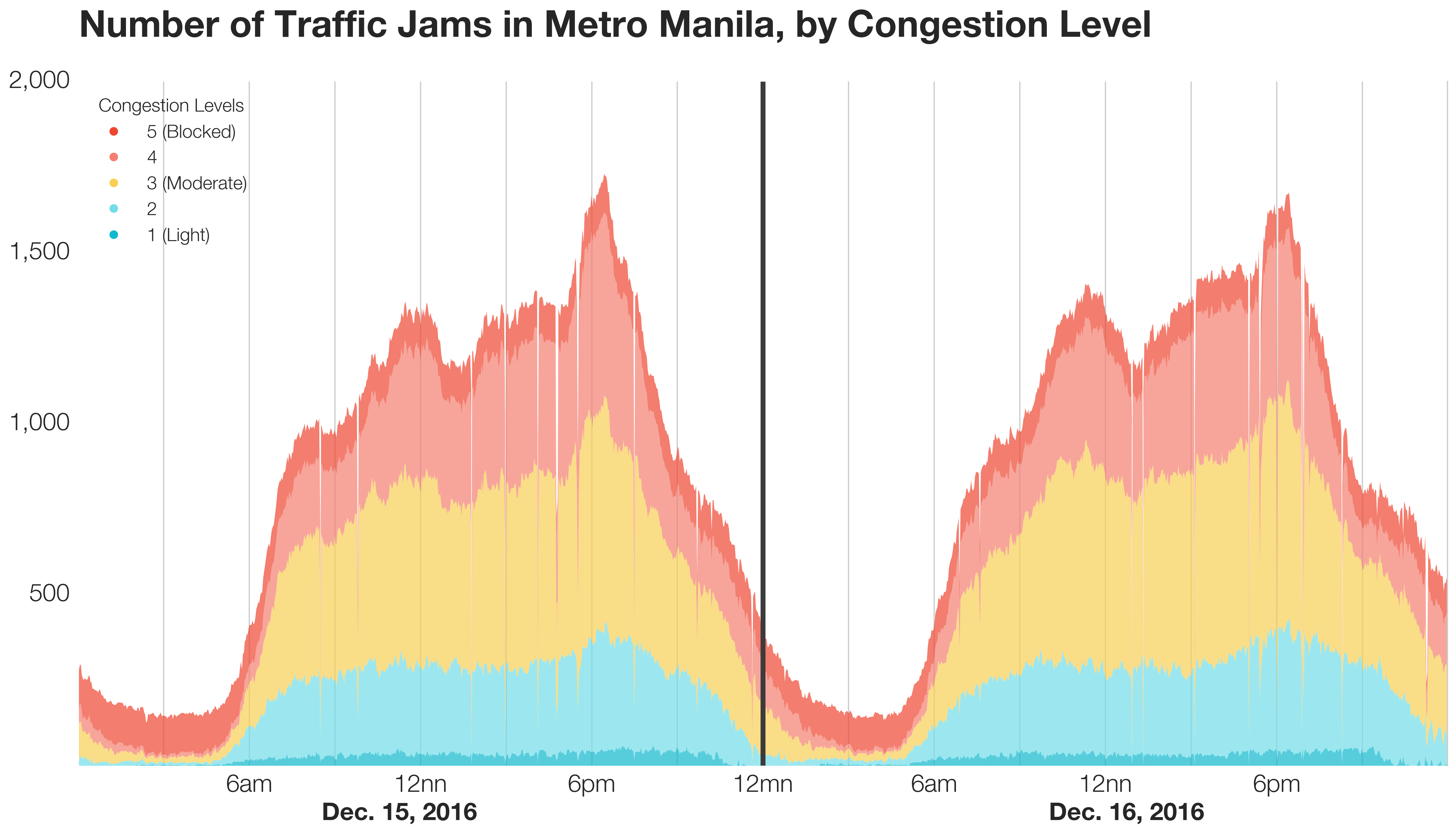
Seems like most of the traffic jams are from levels 2 to 4! A 100% stacked area plot of the same data reveals that during the wee hours of the morning for both days, majority of the “jams” are from blocked roads (level 5):
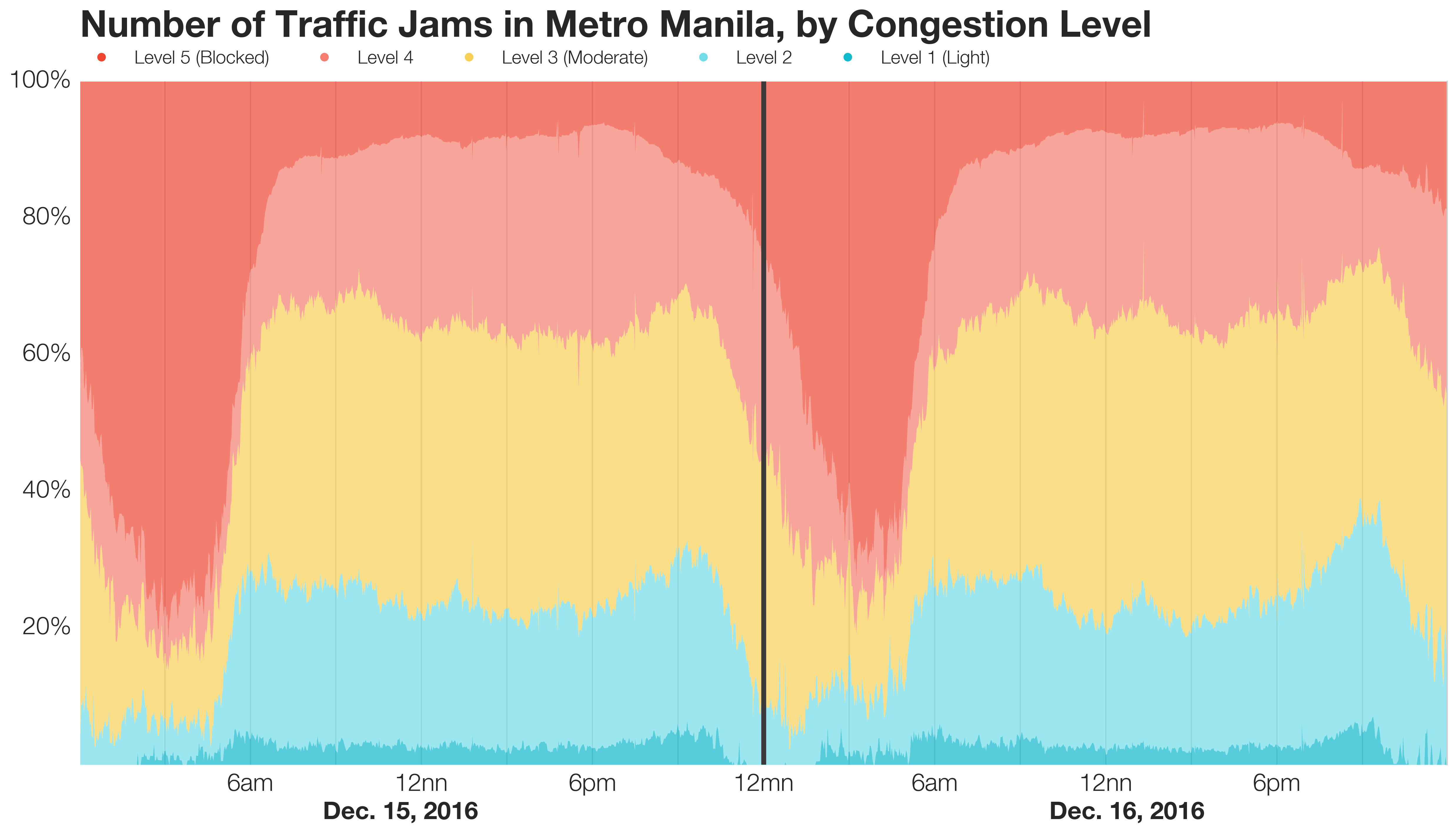
This makes sense since the number of level 5 jams (i.e., blocked roads) was relatively stable over the two days, while the number of traffic jams for other levels dropped between 12 midnight and 6 AM on both days. You can see the stability of road blocks in the line plot below, which shows the differences in magnitude among the 5 congestion levels.
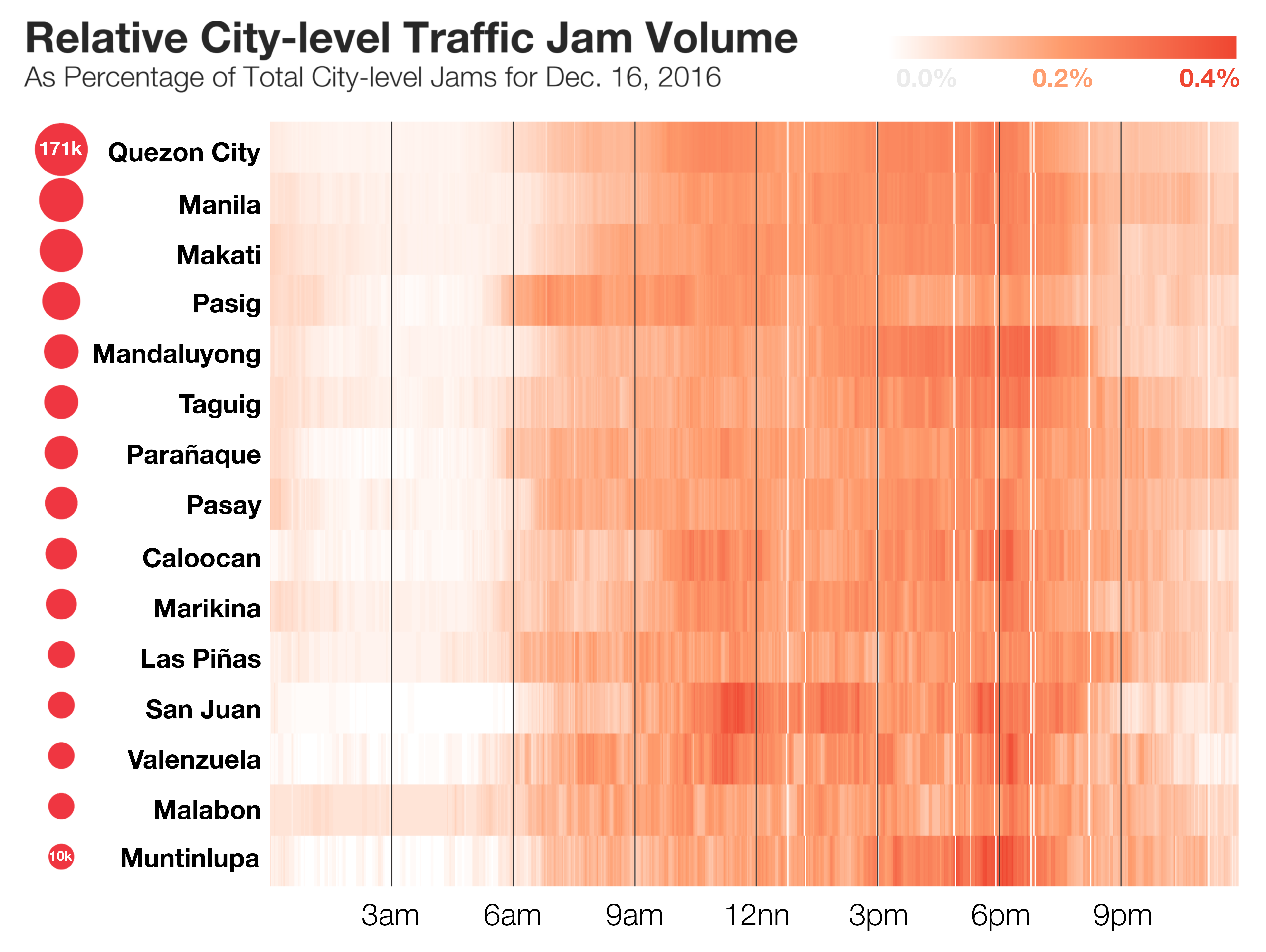
A heatmap of the relative city-level traffic jam volume shows subtle variations per city. For example, traffic peaked around 7 AM in Pasig and at around 12 noon in San Juan. Since it wouldn’t reveal much to compare cities by magnitude一for instance, Quezon City, by its size alone, will overshadow the rest一we used the relative “contribution” of each time interval to the total number of traffic jams per city in a day. To add context, the circles to the left represent the number of traffic jams per city during the two-day period.
Come January, we’ll be working more closely with the MMDA to dive deeper into the data. Some promising areas for analysis: how traffic patterns differ from street to street, chronic traffic choke points, and measuring the impact of different traffic interventions.
Interested in helping us spot patterns? We’ve embedded below an interactive map of the Friday traffic at its peak 5-minute interval at 6:25-6:30pm on Dec. 16. You can zoom in/out using the plus (+) and minus (-) buttons at the upper left, pan around the map using your mouse, or toggle on/off the different traffic congestion levels using layer control box at the upper right, or click on any traffic jam (represented by the highlighted lines) to view the street name, average speed, and travel delay in seconds.
Shameless plug: We do private data visualization workshops! E-mail us at [email protected] to learn more. We're also currently looking for an Operations Associate. If you're incredibly organized, hungry to learn, and excited about data science, we invite you to apply!
Our company's growing fast, and we're hiring an organized, energetic operations associate to help us take things to the next level. We work on a lot of impactful data science projects in the civic sector and the corporate world. This is a great chance for someone young + hungry to get in early, work a ton, and learn a lot. Apply Now!
1. To make the maps, we used the Python library folium (built on the Leaflet.js library) and its built-in CartoDB dark matter basemap, built by its makers using data from OpenStreetMap
2. Jams data is gathered every 2 minutes with street-level granularity. As a tradeoff between image quality and loading speed, we used 15-minute screenshots for the GIF.